| PROJECT 1A - CHARTS & GRAPHS |
|
|
|
|
|
|
|
|
|
|
| Weekly average prices and volumes of Mirant (MIR) and Southern
Company (SO) stock during weeks of Enron collapse |
|
|
| DATE |
MIR CLOSE |
MIR VOLUME |
SO CLOSE |
SO VOLUME |
|
|
|
|
|
| 1/17/2002 |
12.67 |
36420700 |
25.08 |
5979900 |
|
| 1/11/2002 |
13.7 |
27353000 |
24.74 |
6101400 |
|
| 1/4/2002 |
16.03 |
18352200 |
24.81 |
4143400 |
|
| 12/31/2001 |
16.02 |
7189900 |
25.35 |
1222300 |
|
| 12/28/2001 |
15.35 |
20513700 |
25.4 |
5897200 |
|
| 12/21/2001 |
14.3 |
85398700 |
24.52 |
12072400 |
|
| 12/14/2001 |
15.7 |
44910500 |
23.27 |
12607800 |
|
| 12/7/2001 |
25.06 |
11321400 |
22.79 |
9461800 |
|
| 11/30/2001 |
24.41 |
14406900 |
22.75 |
11907600 |
|
| 11/23/2001 |
26.28 |
4981800 |
23.5 |
3948200 |
|
| 11/16/2001 |
27.25 |
9295000 |
23.6 |
5799800 |
|
| 11/9/2001 |
26.3 |
9197700 |
24.18 |
8343200 |
|
| 11/2/2001 |
23.3 |
11656900 |
23.5 |
16472300 |
|
| 10/26/2001 |
27.45 |
11500300 |
24.19 |
9236400 |
|
| 10/19/2001 |
28.98 |
11619300 |
25.16 |
6499500 |
|
| 10/12/2001 |
27.54 |
11196200 |
24.55 |
7381400 |
|
| 10/5/2001 |
24.72 |
10890900 |
25.87 |
9354700 |
|
|
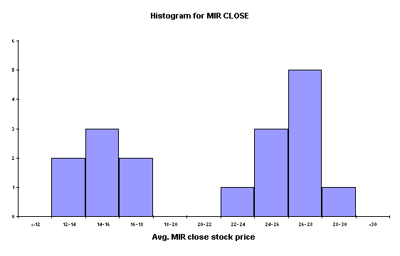
| I gathered weekly stock average data from MSN.com to analyze the
activity of Mirant (MIR) and Southern Co. (SO) stock during the months
surrounding the Enron collapse. I
chose to compare the two stocks during this period due to the recent spin-off
of MIR from SO earlier in the year. I
started by creating a histogram and frequency table to graphically represent
the closing prices of Mirant stock for the period. The histogram revealed a bimodal distribution of Mirant stock
closing price. |
|
|
|
|
|
| Frequency
table for MIR CLOSE |
|
|
|
|
| Upper limit |
Category |
Frequency |
|
| 12 |
<=12 |
0 |
|
| 14 |
12- 14 |
2 |
|
| 16 |
14- 16 |
3 |
|
| 18 |
16- 18 |
2 |
|
| 20 |
18- 20 |
0 |
|
| 22 |
20- 22 |
0 |
|
| 24 |
22- 24 |
1 |
|
| 26 |
24- 26 |
3 |
|
| 28 |
26- 28 |
5 |
|
| 30 |
28- 30 |
1 |
|
|
>30 |
0 |
|
|
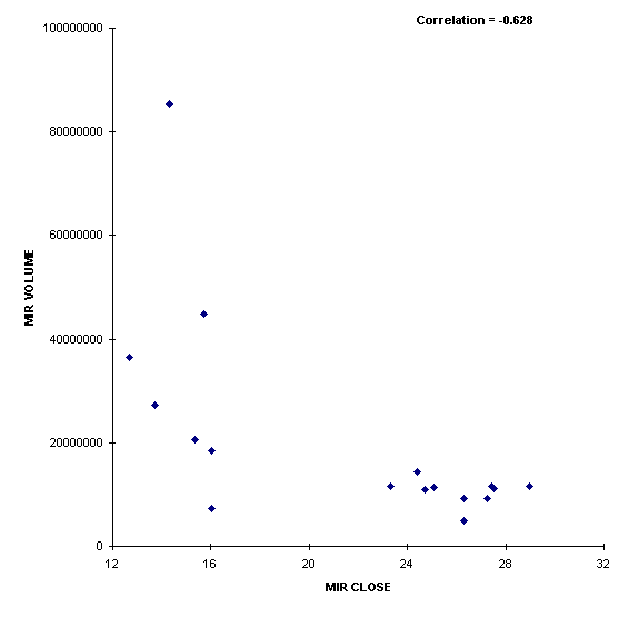
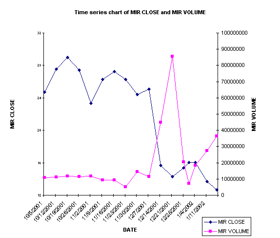
| I
then wanted to see the relationship between volume and closing price for
MIR. A resonably strong linear
realationship was observed by the correlation of -0.628. This supports the idea that the higher the
volume of trading, the lower the closing price of MIR. |
|
|
|
|
|
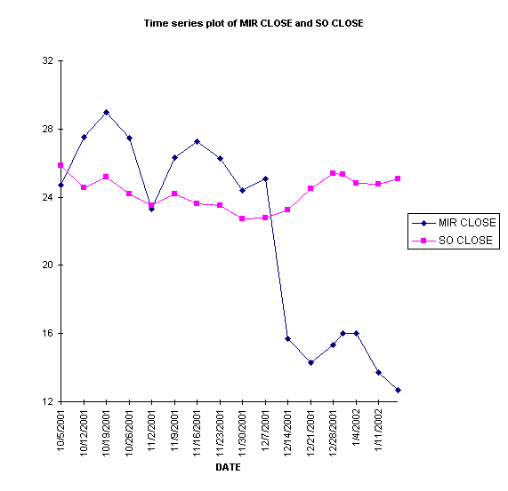
| I
then created a time series line chart depicting the closing price of MIR
versus SO during the time period of Enron's collapse. This plot shows evidence of MIR taking a
plunge along with Enron, while SO remained fairly level. |
|
|
|
|
|
|
|
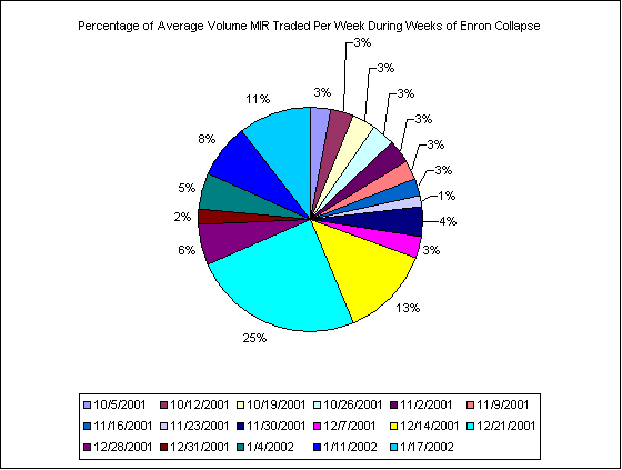
| I
created a pivot table report and pie chart to show the percentage of volume
traded per week for MIR. This chart
shows heavy trading volumes during the weeks of Enron's announcement of
bankruptcy. |
|
|
|
Sum of MIR VOLUME |
|
|
|
DATE |
Total |
|
|
10/5/2001 |
3.15% |
|
|
10/12/2001 |
3.23% |
|
|
10/19/2001 |
3.36% |
|
|
10/26/2001 |
3.32% |
|
|
11/2/2001 |
3.37% |
|
|
11/9/2001 |
2.66% |
|
|
11/16/2001 |
2.68% |
|
|
11/23/2001 |
1.44% |
|
|
11/30/2001 |
4.16% |
|
|
12/7/2001 |
3.27% |
|
|
12/14/2001 |
12.97% |
|
|
12/21/2001 |
24.67% |
|
|
12/28/2001 |
5.93% |
|
|
12/31/2001 |
2.08% |
|
|
1/4/2002 |
5.30% |
|
|
1/11/2002 |
7.90% |
|
|
1/17/2002 |
10.52% |
|
|
Grand Total |
100.00% |
|
|
|
|
|
|
|
|
|
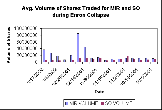
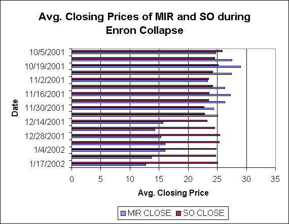
| My
last two graphs are column and bar graphs showing different relationships
between MIR and SO. I created a
column graph and plotted the volumes of MIR and SO. The bar graph shows the relationship between MIR and SO closing
prices, similar to the time series plot created earlier. |
|
|
| DATE |
MIR VOLUME |
SO VOLUME |
|
| 1/17/2002 |
36420700 |
5979900 |
|
| 1/11/2002 |
27353000 |
6101400 |
|
| 1/4/2002 |
18352200 |
4143400 |
|
| 12/31/2001 |
7189900 |
1222300 |
|
| 12/28/2001 |
20513700 |
5897200 |
|
| 12/21/2001 |
85398700 |
12072400 |
|
| 12/14/2001 |
44910500 |
12607800 |
|
| 12/7/2001 |
11321400 |
9461800 |
|
| 11/30/2001 |
14406900 |
11907600 |
|
| 11/23/2001 |
4981800 |
3948200 |
|
| 11/16/2001 |
9295000 |
5799800 |
|
| 11/9/2001 |
9197700 |
8343200 |
|
| 11/2/2001 |
11656900 |
16472300 |
|
| 10/26/2001 |
11500300 |
9236400 |
|
| 10/19/2001 |
11619300 |
6499500 |
|
| 10/12/2001 |
11196200 |
7381400 |
|
| 10/5/2001 |
10890900 |
9354700 |
|
|
|
|
|
|
|
|
| DATE |
MIR CLOSE |
SO CLOSE |
|
| 1/17/2002 |
12.67 |
25.08 |
|
| 1/11/2002 |
13.7 |
24.74 |
|
| 1/4/2002 |
16.03 |
24.81 |
|
| 12/31/2001 |
16.02 |
25.35 |
|
| 12/28/2001 |
15.35 |
25.4 |
|
| 12/21/2001 |
14.3 |
24.52 |
|
| 12/14/2001 |
15.7 |
23.27 |
|
| 12/7/2001 |
25.06 |
22.79 |
|
| 11/30/2001 |
24.41 |
22.75 |
|
| 11/23/2001 |
26.28 |
23.5 |
|
| 11/16/2001 |
27.25 |
23.6 |
|
| 11/9/2001 |
26.3 |
24.18 |
|
| 11/2/2001 |
23.3 |
23.5 |
|
| 10/26/2001 |
27.45 |
24.19 |
|
| 10/19/2001 |
28.98 |
25.16 |
|
| 10/12/2001 |
27.54 |
24.55 |
|
| 10/5/2001 |
24.72 |
25.87 |
|
|
|
|
|
| When
I finished the required graphs and charts I was still curious about how the
relationship between MIR closing price and volume would look on a time series
plot. As was shown in the scatter
plot before, as volume of trading increased the stock price went lower. I think this is a clearer way to represent
the relationship graphically. |
|
|
| DATE |
MIR CLOSE |
MIR VOLUME |
|
| 1/17/2002 |
12.67 |
36420700 |
|
| 1/11/2002 |
13.7 |
27353000 |
|
| 1/4/2002 |
16.03 |
18352200 |
|
| 12/31/2001 |
16.02 |
7189900 |
|
| 12/28/2001 |
15.35 |
20513700 |
|
| 12/21/2001 |
14.3 |
85398700 |
|
| 12/14/2001 |
15.7 |
44910500 |
|
| 12/7/2001 |
25.06 |
11321400 |
|
| 11/30/2001 |
24.41 |
14406900 |
|
| 11/23/2001 |
26.28 |
4981800 |
|
| 11/16/2001 |
27.25 |
9295000 |
|
| 11/9/2001 |
26.3 |
9197700 |
|
| 11/2/2001 |
23.3 |
11656900 |
|
| 10/26/2001 |
27.45 |
11500300 |
|
| 10/19/2001 |
28.98 |
11619300 |
|
| 10/12/2001 |
27.54 |
11196200 |
|
| 10/5/2001 |
24.72 |
10890900 |
|
|
|
|
|
|
|
|
|
|
|
|
|
|
|